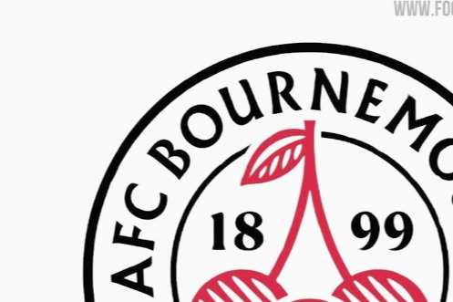
Bournemouth's head of commercial operations insists the club has no plans to change the badge despite the design of a new badge being leaked online.
The Cherries logo has been the same since 2013: a cartoon head pretending to be Dickie Dowsett, one of BournemouthThe top scorers of all time, heading a ball with red and black stripes in the background.
The south coast side looked set to completely change their logo for the first time in over ten years.
football headlines reported that Bournemouth have submitted a trademark application for the new badge with the club adopting a circular design, with “AFC Bournemouth” and “The Cherries” written around the edge.
In the center of the design appears a bouquet of cherries, which represents its nickname, in a suitable cherry red color, with a soccer ball in the center of the fruit also of the same color.
Many fans gave their opinion on the design, but Bournemouth's head of commercial operations Jim Frevola insisted this will not appear on shirts any time soon.
Posting a photo of Bournemouth's current badge, Frevola said on X: “There's nothing to see here.
“The brand logo that people read about today is part of securing our logos for future use (think retail).
“We wouldn't consider changing this core beauty of a badge without significant fan consultation.”
Aston Villa changed its logo to be round this season, while Brentford It also changed to a circular design in 2017.


